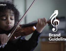
Brand Guidelines for Pelican Music
- Estado: Closed
- Premio: £100
- Propuestas recibidas: 45
- Ganador: merumedia

Resumen del concurso
Pelican Music provide high quality instrumental & music theory training for young musicians. We're looking to create a more developed brand identity, typography and colour palette.
Please read the brief carefully! We've tried to be clear about what do/don't want and will reject entries which ignore this guidance.
We have a logo we're really happy with (attached) but we have been inconsistent in terms of our wider brand (merchandise, typography and colour etc). We already have a website (linked below) and have had t-shirts etc made, but we're now looking to settle on a set of colours and fonts we can pair with our logo and roll out across all existing and new stationary (notebooks etc), business cards, flyers, t-shirts and more.
See attached brand examples for the kind of thing we're looking for.
THE FOLLOWING WILL BE RATED AND CONSIDERED:
1. A palette of colours which work well together (stick to ~5 max). See attached for *examples* of colours we like.
2. A title and content typeface (can be different) - should work with the logo and across paper/document/web
3. (optional) A logo typeface - we like the typeface on our logo but are open to changing it if required
THE FOLLOWING WILL BE REJECTED
- Any major changes to our base logo (attached)
- Any designs where the logo is not a single, solid colour (i.e., gradients or multiple-colors)
- Any designs which don't include a colour palette and typography guide
We'd ideally prefer our logo to be white-on-colour if colour is used.
Resources:
I've attached some examples of what we have now, as well as a (very rough) example of colours we like. Very keen that we see something better and more cohesive though as these were put together in 5m! We'd like to see a well thought through and complementary colour palette. Happy to provide any additional context or reference imagery needed.
Reference links:
- Our site: https://www.pelican-music.co.uk
- Inspiration (not expecting anything quite so comprehensive!): https://blog.hubspot.com/marketing/examples-brand-style-guides
- Example brand guidelines: https://dmeu2ky7yoz4d.cloudfront.net/alchemy-attachments/2017/04/07/05/35/13/aae94df7-d1e2-4e1a-8385-0379a475286a/FrugallySustainableBrandGuidelines.pdf
- https://www.freelancer.com/showcase/i/healthy-food-platforms-brand-board/127125
- https://www.freelancer.com/showcase/i/develop-a-brand-identity-for-an-album-print-company/87747
Habilidades recomendadas
Tablero de aclaración pública
-

bappydesign
- 6 años atrás
Please Check #184
- 6 años atrás
-

luckytruong
- 6 años atrás
Please check #178 . Thanks!
- 6 años atrás
-

aaditya20078
- 6 años atrás
PLEASE CHECK #182 AND FEEDBACK THANKYOU
- 6 años atrás
-

prvnvrma
- 6 años atrás
Kindly check #181. Thank You.
- 6 años atrás
-

Pootnik
- 6 años atrás
Btw you have copied my entry with position & font #162 Only shear angle is different, i corrected it to 90 degree. Also changed some font parts. :***
- 6 años atrás
-

Organizador del concurso - 6 años atrás
@dimitrije I'm really sorry but I have no idea what you're trying to say to us. Could you please clearly outline your feedback?
- 6 años atrás
Ver 5 mensajes más
-
Organizador del concurso - 6 años atrás
> I can also download someones unique template for brand guidelines and drag and drop logo in many colors.
I don't really mind what framework people follow so long as it isn't plagiarism. Yes, I'd like to see more original thought here but it follows the brief. If you can do better (nicer typeface, better colours), please go ahead, we'd love to see it!
At the end of the day, we want a nice colour-scheme that works and some fonts which go well together with our logo and we'll pick a winner from entries which do that.- 6 años atrás
-
Organizador del concurso - 6 años atrás
Assuming you removed your proposal out of annoyance. It's a shame, we actually quite liked it and were going to give you some feedback (mainly just on the colours). If you re-submit we will still do so but if you'd rather not participate I respect that deecision.
- 6 años atrás
-

tuanzrahim
- 6 años atrás
Please check #170 updated design with font and additional colors as requested...
- 6 años atrás
-

joeblackis17
- 6 años atrás
Hello , I'm a music producer and also a graphic designer and I design only logos and artworks for Music Bands / Musicians / DJ/ Music Producers. Please check my portofolio below and let me know if you are interested to work together. Thank you :)
- 6 años atrás
-
joeblackis17
- 6 años atrás
https://www.freelancer.com/u/joeblackis17
- 6 años atrás
-

Dedijobs
- 6 años atrás
please check Entry #169
- 6 años atrás
-
aaditya20078
- 6 años atrás
please check #168 thanks
- 6 años atrás
-

gherbert1970
- 6 años atrás
Dear Dimitrije L, I noticed that your Entry #153 has latin in it. Do you speak latin or did you use a template yourself?
- 6 años atrás
-
Pootnik
- 6 años atrás
Simple guidelines for typeface font on print material & webpage. Also visual guidelines for brochure in minimal lines. All can be gently translated on car wrap, music school decoration, Simple imagination, what is your entry? Template from net? You even put same PROXIMA bold font with same mistake from template (mixed with PROXSIMA BOLD ITALIC) Also random glued logos with many chaos. YOU ARE NOT PROBLEM, like you here has many poor poor amateurs. CH is problem, he put that like inspiration, and rate same but also much uglier???? WTF
- 6 años atrás
-
Pootnik
- 6 años atrás
ALL guidelines in terms of WHAT TO DO with logo and what not is last important thing, WHAT IS point to download template (steal) from net and only put same logo and where is writen "do not distort" you distort same logo, and ETC ???? Than writen "do not change font" and you change it?? And et the end HaY SIR look my design, i VERY proffesional bla bla bla
- 6 años atrás
-

ratax73
- 6 años atrás
check #161 and feedback thanks
- 6 años atrás
-

mosumiakthar
- 6 años atrás
please check
- 6 años atrás
-
prvnvrma
- 6 años atrás
Kindly Check #154. Thank You.
- 6 años atrás
-
aaditya20078
- 6 años atrás
PLEASE CHECK #150 & #151 AND FEEDBACK THANKYOU
- 6 años atrás
-
Organizador del concurso - 6 años atrás
#34, #69 , #20 , #19 , #28 , #46 , #66 - getting a little closer to the brief (colour palette). We'd like to see more "brand" work there though, rather than just our logo on the colours we provided though.
We have some design skills in our office, what we're looking now is for someone to help us re-think the wider brand. Ensure our colours, logo and typeface work well together.
See the attached brand examples for the kind of thing we're after.- 6 años atrás
-
tuanzrahim
- 6 años atrás
How about #148 ?
- 6 años atrás
-
tuanzrahim
- 6 años atrás
Hi can you check #148 and let me know your thoughts :) thanks
- 6 años atrás
-

djamalidin
- 6 años atrás
pleasee check #138
- 6 años atrás
-
prvnvrma
- 6 años atrás
Kindly Check #134 #135 #136 #137. Thank You.
- 6 años atrás
-

bmely
- 6 años atrás
pleasee check #128
- 6 años atrás
-

mdrozen21
- 6 años atrás
pleasee check #112
- 6 años atrás
-
Dedijobs
- 6 años atrás
please check Entry #107
- 6 años atrás
-

diviehirna
- 6 años atrás
please see entry #93 tq
- 6 años atrás
-
Organizador del concurso - 6 años atrás
Hey folks,
Just been through and rated/rejected a number of designs. I've now attached examples of the type of brand sheet we're looking for to the project - please take a look!
#23 - no branding other than logo on a card
#24 - No gradients please, solid colour only
#25 ~#35 etc - Please don't alter our primary logo, we love it!
#42 - not sure you uploaded the right design?
#20 - we think what you've done with the logo is quite clever but not keen on the font typeface
#22 - no gradients please
See updated attachments for the kind of thing we're looking for in terms of a "brand sheet" we can use going forward.- 6 años atrás
-

jabbazaul
- 6 años atrás
see entry #78
- 6 años atrás
-

tim1965
- 6 años atrás
Please see #11
- 6 años atrás
-
Organizador del concurso - 6 años atrás
Hi Tim, thanks for your submission and for putting an entry forward. Unfortunately we weren't that keen on it. It's a little too drastic in terms of re-design. We're really just looking for colours and fonts which work well with our logo on different media.
- 6 años atrás
-

mahmudkhan44
- 6 años atrás
Entry #46
- 6 años atrás
-
Organizador del concurso - 6 años atrás
Folks - in case it wasn't clear from the brief, we do not want a new logo.
- 6 años atrás
-
Organizador del concurso - 6 años atrás
Really sorry if things were unclear, I've updated the brief, logos etc were attached so not sure where the confusion was coming from. I've rejected existing entries to make it clear they're not what we're looking for.
Thank you to everyone who submitted but please stick to the brief.- 6 años atrás
-
tuanzrahim
- 6 años atrás
Hi I started working on it... hope you won't end the contest anytime sooner :)
- 6 años atrás
-

sojib8184
- 6 años atrás
#30,31,32,33
- 6 años atrás
-

Viclates
- 6 años atrás
Please check #16
- 6 años atrás
Cómo comenzar con los concursos
-

Publica tu concurso Fácil y rápido
-

Consigue toneladas de propuestas De todo el mundo
-

Elige la mejor propuesta ¡Descarga fácilmente los archivos!