Design a Logo
- Estado: Closed
- Premio: $150
- Propuestas recibidas: 51
- Ganador: towhidhasan14

Resumen del concurso
I am starting a company where the brand name is the URL of the website.
The URL is "co-e.co"
The company is therefore called "co-e.co" or simply "co-e".
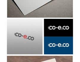
The competition is to design a logo for the company which is the URL, or contains the URL as the primary design.
The business is about transporting goods by electric vehicles (electric cargo bicycles and electric vans). The Logo should reflect this sense of movement / transportation of goods.
A concept I have and that I would like to see developed is that the "co" at the start and end of the URL are the wheels of a vehicle, and they are transporting the "e". Please see the attached image I have mocked up. It is likely that the winning entry will be well resolved version of this concept. It may simply be a simple, clean, well composed (ie. symmetrical and visually appealing) version of my mock-up.
However, I'm not limiting it to this - please feel free to be creative and bring other ideas to the table. In my mind, the logo is made up only of the URL, with no other images. But you may have different ideas. You may have a clever way of turning the "co" into wheels by adding tyres, spokes, an axle etc. Or you may have a clever way of simply "hinting" at the notion that it is wheels in motion transporting goods, but essentially the logo is text only. You are completely free to do this to make the text into an image that creates a sense of transporting goods.
The only rule is: the URL "co-e.co" must be completely legible, and recognisable as a URL.
Colours: Undecided. Probably a maximum of two colours, though you might choose a bunch of primary colours like the new "google" logo. Up to you. However, I will also want a greyscale version.
Font: Up to you. If you use a font, it must convey the concept above. Or you may simply create the text with shapes (this is how I created my mock-up)
Deliverables:
.eps .jpg .gif of a standard version of a logo for light backgrounds and a "reversed" version suitable for dark backgrounds
Happy Designing!
Habilidades recomendadas
Comentarios del empleador
“Fantastic Work - understood what I wanted, very fast and creative, went above and beyond! ”
![]() simonrashleigh, Australia.
simonrashleigh, Australia.
Tablero de aclaración pública
-

Organizador del concurso - 7 años atrás
Thanks for all the entries! it was fun. Best of luck to you all...
- 7 años atrás
-

JoseValero02
- 7 años atrás
Check #274 #275 #276
- 7 años atrás
-

hisokahicham20
- 7 años atrás
https://ahmed20fawi.wixsite.com/make-good if you want help children please
- 7 años atrás
-

a2z007
- 7 años atrás
Please Check Entry #272
- 7 años atrás
-

Nabs Studio
- 7 años atrás
#271 please check
- 7 años atrás
-

Mithon1
- 7 años atrás
Please Check #267 .Thanks
- 7 años atrás
-

BISMILLAHIRHMANIRAHIM
- 7 años atrás
#249
- 7 años atrás
-
Mithon1
- 7 años atrás
Please Check #142,#143.Thanks
- 7 años atrás
-

omarfaruq1115
- 7 años atrás
Check#228..#229.
- 7 años atrás
-
BISMILLAHIRHMANIRAHIM
- 7 años atrás
Hello Sir , Please check #227 and feedback Thanks
- 7 años atrás
-
Organizador del concurso - 7 años atrás
Thanks everybody. Only a couple of days to go. I need to cull some entries...it doesn't mean I don't appreciate the work, I just have to narrow down the field...hope you understand. after that I will be back with my final comments...
- 7 años atrás
-

rashedkhanbd
- 7 años atrás
please check #188 #189 any change feedback please
- 7 años atrás
-
BISMILLAHIRHMANIRAHIM
- 7 años atrás
hi there, Please check #183,#184,#185, #186 and feedback Thanks
- 7 años atrás
-
Organizador del concurso - 7 años atrás
We are getting closer guys and thanks for all the entries! As I said in the description, if you can make it look like wheels you are doing well. Also, a tip - maybe forget about colour for now, what I want is a shape! A shape that could be engraved stamped onto plastic for example and be instantly recognizable. So in terms of shapes I love #30 the simplicity, #155 has the best spin, #150 the best spokes. Perhaps I will be convinced by the most simple shape in greyscale and your entry might have both "co-e" and "co-e.co". Good luck and thanks for your continued creativity
- 7 años atrás
-
BISMILLAHIRHMANIRAHIM
- 7 años atrás
I did not understand that Top entries are followed by same concept of mine and I have been rejected while these are on top level. ?
- 7 años atrás
-
Organizador del concurso - 7 años atrás
Hi Mooedrathor, It was because they were too much copies of ones I like, and I think you worked it out with your later entries - your first entries didn't really look like wheels so that's why you were rejected...later entries do look like wheels and have not been rejected
- 7 años atrás
-
BISMILLAHIRHMANIRAHIM
- 7 años atrás
#152
- 7 años atrás
-
BISMILLAHIRHMANIRAHIM
- 7 años atrás
hi there, check #149,#150,#151 and feedback Thanks
- 7 años atrás
-
omarfaruq1115
- 7 años atrás
Check #133.
- 7 años atrás
-
BISMILLAHIRHMANIRAHIM
- 7 años atrás
hi there, Please check #121,#122 and feedback Thanks
- 7 años atrás
-

hasbyarcplg01
- 7 años atrás
please check entry #106 #107 #108 Thanks.
- 7 años atrás
-

JoyAhmad
- 7 años atrás
plz check entry #101 #102 #103 #104 #105
- 7 años atrás
-
Organizador del concurso - 7 años atrás
Thank you everybody. This is fun and i love the creativity! I'm going away for the weekend, back on Sunday 29 January and will provide further feedback then. I still haven't seen any "wheels" from the "CO" that really convince me. I'd love somebody to come up with an idea to infer they are wheels without using spokes. Also, think about perspective - how can we make the logo look like it has some "depth" ie that we are looking from the side and it appears that the wheel of the "C" is behind (more distant) than the wheel of the "O". Good luck and speak after the weekend :)
- 7 años atrás
-
JoyAhmad
- 7 años atrás
plz check entry #101 #102 #103 #104 #105
- 7 años atrás
-
omarfaruq1115
- 7 años atrás
Check#68..#77.
- 7 años atrás
-
Mithon1
- 7 años atrás
Please Check #73#76#69.Thanks
- 7 años atrás
-
hasbyarcplg01
- 7 años atrás
please check entry #70 Thanks.
- 7 años atrás
-
Organizador del concurso - 7 años atrás
Hi all...thanks for the designs so far. Now that I've seen a few I definitely think 1 or 2 colours is better, so please ignore my suggestion for the google logo primary colours - that's not going to work. Simple and clean is what I want: less is more, so the designs i like to date don't have much detail but communicate the idea with style in a simple way...
- 7 años atrás
-
JoyAhmad
- 7 años atrás
Sir please check entry #61 #62. Hope you like it. Thanks.
- 7 años atrás
-

marcelorock
- 7 años atrás
please #sealed
- 7 años atrás
Ver 2 mensajes más
-
marcelorock
- 7 años atrás
Hi,
When the contest is sealed avoid other competitors copying the ideas of others, so the level of creativity and originality remains high.- 7 años atrás
-

DjIloveDESIGN
- 7 años atrás
its much better not sealed so we can see whos copying stock logo on the web.
- 7 años atrás
Cómo comenzar con los concursos
-

Publica tu concurso Fácil y rápido
-

Consigue toneladas de propuestas De todo el mundo
-

Elige la mejor propuesta ¡Descarga fácilmente los archivos!