Design a Logo for AnnotatedTimeLine.ORG

  • Estado: Closed
  • Premio: $50
  • Propuestas recibidas: 3
  • Ganador: yogeshbadgire

Resumen del concurso

I need a logo for AnnotatedTimeLine.org

- MUST BE READABLE. Nothing so stylish it is hard to figure out. It should be CLEAR at a GLANCE.

- Choose a complementary BUSINESS color palette that catches your attention but is still pleasing to the eye. I DO NOT want anything too gaudy or garish. Or amateurish... if I think I can make it MYSELF, I will immediately reject the entry (because I do not want to do it myself but will not pay someone for THAT). I want a more professional "look".

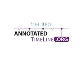
- Include some kind of "time line" icon/graphic/image, even if very small and subtle. See links below for examples of timelines, but yours doesn't have to be an exact copy if you have a creative idea. NO CLOCKS! That's been established in previous contests.

- SIMPLER is better than COMPLEX. Don't just throw a bunch of clip art out there... have a reason for it. If it looks like something seen a thousand times, don't do it. Perhaps it just has clean lines, maybe it's made abstract in some way, I'm open to your creative ideas.

- I DO want the ".org" to be a part of the logo so people don't confuse it with the more common .com.

- We MAY want to use the tag line "FREE DATA" with the logo... your choice to see how it might look.

Please deliver the ORIGINAL ART files and exact font name(s) used so I can adapt the logo in the future if needed. At minimum, I want the LAYERED format (not flattened) files.

Here are a couple of previous contest-winning logos so you can get an idea of the kind of "look" I tend toward:

http://TLSN.com
http://VIZdex.com

LAST... I know you spend valuable time on this content, so let's please spend it well. please DO NOT just post a message just to look at your entry... I PROMISE, I will look at it. Feel free to ask specific questions, however... I will provide any clarification you need..

Thanks for your time and effort.

Habilidades recomendadas

Comentarios del empleador

“followed instruction well, gave options”

Imagen del perfil gluedtothescreen, United States.

Tablero de aclaración pública

  • gluedtothescreen
    Organizador del concurso
    • 10 años atrás

    If anyone is interested:
    https://www.freelancer.com/contest/Design-a-Logo-for-TimeLine-Player-51112.html

    • 10 años atrás
  • janithnishshanka
    janithnishshanka
    • 10 años atrás

    Thanks for rejected Good Luck for winner :)

    • 10 años atrás
  • gluedtothescreen
    Organizador del concurso
    • 10 años atrás

    looking good, don't you think?

    1. Change TimeLine to #5F1F73 ... that blue doesn't work well so let's try purple.
    2. Can you tighten up everything BELOW the timeline a bit? Move ANNOTATED up just a bit... and move TImeLine.ORG up a bit
    3. On TOP of the timeline, let's also move "free data" just a few pixels higher.

    thank you!

    • 10 años atrás
  • gluedtothescreen
    Organizador del concurso
    • 10 años atrás

    PLEASE NOTE... there are NO JAGS in the timeline, it is LITERALLY a straight line. You can abstract it but don't change its basic design. I WANT TO BE CONSISTENT in representing the timeline symbol.

    GO HERE to see an ACTUAL timeline in action (~3M large animated image file):

    http://poddvr.com

    Hopefully, this will provide some INSPIRATION. I am NOT looking for an exact copy, I want a SYMBOL of the timeline.

    thank you very much

    • 10 años atrás
  • gluedtothescreen
    Organizador del concurso
    • 10 años atrás

    FEEDBACK:

    31 - you might try it with the timeline ABOVE the words... have to move FREE DATA too? don't know, use your eye

    13 - too much... maybe make TIME and LINE the only dropdown boxes... maybe .org

    23 - this is really more to the point BUT the .org is lost

    YOU MIGHT TRY:

    ---- BIG, BOLD .ORG.... maybe inverted colors? maybe turn it on its side? make it STAND OUT!

    ---- I don't like the name all in one line... it's just too long. We need to STACK some of the words/letters LIKE #13 (ANNOTATED is above the rest of the text)... be creative!

    ---- I am undecided whether TIME and LINE should be 1 word or 2. I lean to one word BUT the First Letters must stand out to make it readable.

    ---- I want this COLOR palette to be a little BOLDER than previous ones. Maybe leaning to the reds, grays, black, white where strong contrast can be achieved.

    • 10 años atrás
  • gluedtothescreen
    Organizador del concurso
    • 10 años atrás

    Hmmm... I think I've figured out why some of my comments seem to get posted several times... ALWAYS happens when I use Firefox. I often use Chrome and it doesn't do it them. It's some kind of browser problem that Freelancer needs to fix.

    • 10 años atrás
  • gluedtothescreen
    Organizador del concurso
    • 10 años atrás

    None of the ideas so far are reaching out to me.

    Take a look at the timelines in the links... no NOT make a timeline that looks structurally different. That is, our timeline has dots along a line and boxes that drop down from them... don't PORTRAY it differently (boxes above the line, lines going all directions, etc). Use your own style, but it should look similar.

    Let's also EMPHASIZE the .ORG

    I appreciate your work!

    • 10 años atrás
  • gluedtothescreen
    Organizador del concurso
    • 10 años atrás

    The QUIRK is back! #9!!!!!

    Sorry, would if I could but can't because NO clock!

    TIMELINE

    • 10 años atrás
  • gluedtothescreen
    Organizador del concurso
    • 10 años atrás

    The QUIRK is back! #9!!!!!

    Sorry, would if I could but can't because NO clock!

    TIMELINE

    • 10 años atrás
  • gluedtothescreen
    Organizador del concurso
    • 10 años atrás

    Please read the brief... no clocks.

    Also, not to be mean, but I do NOT want your comments here unless it is a legitimate message (so rejected, sorry). No time to waste if you cannot follow instructions.

    • 10 años atrás
  • gluedtothescreen
    Organizador del concurso
    • 10 años atrás

    Note that the brief has been update: POSSIBLE use of a tag line with this logo: FREE DATA

    If I see something creative using that phrase, it will give you an edge. But, the logo MAY end up not using the tag line at all.

    thanks.

    • 10 años atrás
  • gluedtothescreen
    Organizador del concurso
    • 10 años atrás

    NO CLOCKS. That's been established in previous contests... it's a timeline (see links) or timeline METAPHOR (and I would enjoy seeing some creative entries for this component of the logo!).

    thanks for your time.

    • 10 años atrás
  • gluedtothescreen
    Organizador del concurso
    • 10 años atrás

    Wow... please note that I only pressed the submit button ONE TIME... have no idea where all those. I looks pretty HARSH, huh? Not my fault or intention!!!!!

    thanks very much freelancer or whoever made the message "bounce" so many times.

    • 10 años atrás
  • gluedtothescreen
    Organizador del concurso
    • 10 años atrás

    READ THE REQUIREMENTS: .org MUST be in the logo.

    • 10 años atrás
  • gluedtothescreen
    Organizador del concurso
    • 10 años atrás

    READ THE REQUIREMENTS: .org MUST be in the logo.

    • 10 años atrás
  • gluedtothescreen
    Organizador del concurso
    • 10 años atrás

    READ THE REQUIREMENTS: .org MUST be in the logo.

    • 10 años atrás
  • gluedtothescreen
    Organizador del concurso
    • 10 años atrás

    READ THE REQUIREMENTS: .org MUST be in the logo.

    • 10 años atrás
  • gluedtothescreen
    Organizador del concurso
    • 10 años atrás

    READ THE REQUIREMENTS: .org MUST be in the logo.

    • 10 años atrás
  • gluedtothescreen
    Organizador del concurso
    • 10 años atrás

    READ THE REQUIREMENTS: .org MUST be in the logo.

    • 10 años atrás

Mostrar más comentarios

Cómo comenzar con los concursos

  • Publica tu concurso

    Publica tu concurso Fácil y rápido

  • Recibe montones de propuestas

    Consigue toneladas de propuestas De todo el mundo

  • Elige la mejor propuesta

    Elige la mejor propuesta ¡Descarga fácilmente los archivos!

Publica un concurso ahora o únete a nosotros hoy