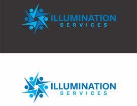
Design a Logo - Illumination Services
- Estado: Closed
- Premio: $250
- Propuestas recibidas: 79
- Ganador: ji2graphic
Resumen del concurso
Illumination Services is a merchant services company, with an emphasis on community, support, and transparency.
We provide merchant level sales, training, consultancy all centered around improving our members revenues while reducing their risk.
Ideally, a logo for Illumination will suggest TRUTH, COMMUNITY, BELONGING, or EMPOWERMENT. We want our members to know they BELONG, as one might belong in a church group, or a social club.
Habilidades recomendadas
Comentarios del empleador
“Appeared to be one of the few that actually read the description and provided a fantastic, on-point design. A+ work.”
![]() seanslavik, United States.
seanslavik, United States.
Tablero de aclaración pública
-

KhawarAbbaskhan
- 6 años atrás
check 2nd logo in first row ,
http://www.gtgraphics.org/generics/generic_logotypes9c.jpg
Its 100% copy- 6 años atrás
-

KhawarAbbaskhan
- 6 años atrás
check 2nd logo in first row ,
http://www.gtgraphics.org/generics/generic_logotypes9c.jpg
Its 100% copy- 6 años atrás
-

KhawarAbbaskhan
- 6 años atrás
finnaly I found the link from where the winner copied design
Its 100% same copy and the link is very famous for overused designs , check here
http://www.gtgraphics.org/generics/generic_logotypes9c.jpg- 6 años atrás
-

nandagasperini
- 6 años atrás
Sir, I would like to inform you that my work is 100% original. If you are satisfied with it you can look for me. You have selected my entry with 4 stars, Thank you! #14
- 6 años atrás
-

nandagasperini
- 6 años atrás
Can you call me on the chat?
- 6 años atrás
-

Organizador del concurso - 6 años atrás
Fabio, I wonder what that benefits you? "Reporting" a logo I put on my webpage, for instance, doesn't make your design better. It just means that I have to go to the trouble of taking the copyright transfer and reporting the fraud to freelancer, then potentially having to sue freelancer for providing the transfer of copyright agreement that we had to sign... As it is, the "spilt milk" complaints since the contest closed have really just made me never want to post another contest here again.
- 6 años atrás
Ver 2 mensajes más
-

Organizador del concurso - 6 años atrás
I'll keep that under advisement; I will instead save my money and no longer post opportunities on freelancer.
- 6 años atrás
-

nandagasperini
- 6 años atrás
Sir, I would like to inform you that my work is 100% original. If you are satisfied with it you can look for me. Thank you! #14
- 6 años atrás
-

DonRuiz
- 6 años atrás
I will take care to report your logo when you upload on your webpage. Good luck
- 6 años atrás
-

DonRuiz
- 6 años atrás
How easy is to win $250, for the newbies by doing just a copy paste... there are to many ideas on internet that can be used as 1000x times if a copy paste would be valid on the serious market. The only person that needs to be "happy" is the contest holder that pays $250 for a genuine copy. Let's see if when the right time you need to register it on the intelectual property agency would be valid. Then don't cry for being ingenuous
- 6 años atrás
-

KhawarAbbaskhan
- 6 años atrás
just a suggestion.
Make a simple jpeg image of the winning logo .
only the icon not text .
Put this icon jpeg image into https://www.tineye.com ,
You will see the similarities .- 6 años atrás
-

KhawarAbbaskhan
- 6 años atrás
the winning design is overused concept :
https://www.google.com/search?q=connected+people++logos&client=opera&tbm=isch&tbs=rimg:CYSQd9rkBHsJIjj1vMVWz3Tj64qEE-9aw_1kWOmJ5EFl9itszU_1T4bQKY9Y26LXpT0C3naPG5lbX-eAan7cmqlTbJIioSCfW8xVbPdOPrEaA7HCt2XYfTKhIJioQT71rD-RYRZctLaojzBwYqEgk6YnkQWX2K2xHwfgSyztAlxioSCTNT9PhtApj1EfellvWyv4SqKhIJjbotelPQLecRLAu6QjTk1JsqEglo8bmVtf54BhFKUpR508wSkioSCaftyaqVNskiERggT1gUPei1&tbo=u&sa=X&ved=0ahUKEwjgmNOFo9PWAhWIMhoKHYmUB80Q9C8IHw&biw=1366&bih=658&dpr=1#imgrc=up7E8pQT8LUbyM:- 6 años atrás
-

nandagasperini
- 6 años atrás
The winning entry is not a copy, just like many out there, but it is not a copy
- 6 años atrás
-

Organizador del concurso - 6 años atrás
Thank you for your input Khawar, however it better exemplified the brand strategy that I requested.
- 6 años atrás
-

marcusodolescu
- 6 años atrás
#171 . I am looking forward for your feedback. Thank you.
- 6 años atrás
-

cbarberiu
- 6 años atrás
Please check #133 #134 #135 #136 #137 #138 thank you :)
- 6 años atrás
-

apon11
- 6 años atrás
Please check #118 Thank you.
- 6 años atrás
-

cbarberiu
- 6 años atrás
#82 thank you :)
- 6 años atrás
-

nandagasperini
- 6 años atrás
Pls check #76 . Thank you
- 6 años atrás
-

nandagasperini
- 6 años atrás
Pls check #73 . Thank you
- 6 años atrás
-

amstudio7
- 6 años atrás
Check #57, #58, #59, #60
- 6 años atrás
-

zaidqamar3
- 6 años atrás
have a look at #47 #48 #49 #50
- 6 años atrás
-

cbarberiu
- 6 años atrás
please check #35 #39 thank you :)
- 6 años atrás
-

cbarberiu
- 6 años atrás
Hi, please check logo and explanations regarding the design in #35 , if possible, leave private feedback there. Thank you!
- 6 años atrás
-

cretiveman00
- 6 años atrás
- 6 años atrás
-

cretiveman00
- 6 años atrás
- 6 años atrás
-

nandagasperini
- 6 años atrás
#14 pls. Thank you
- 6 años atrás
-

Organizador del concurso - 6 años atrás
Good looking design. Might be a little more "corporate" than what we need, but thank you for submitting!
- 6 años atrás
-

nandagasperini
- 6 años atrás
Thank you very much for your rating. Do you want any changes? Colors or font?
- 6 años atrás
-

DimitrisTzen
- 6 años atrás
Check please entry #13
- 6 años atrás
-

Organizador del concurso - 6 años atrás
It's a clever idea; "Illuminati"-esque. I'm not sure that parallels to a secret society rumored to control the world are quite on point though. Thanks for submitting!
- 6 años atrás
-

hkimojohn21
- 6 años atrás
Just to make it sure. you want us to make a logo for the "Illumination services" word?
- 6 años atrás
-

Organizador del concurso - 6 años atrás
Hi, thanks for asking; Just a general logo. This can be either inclusive of the Illumination Services wording, Illumination (alone), or just iconic. It's about creating an engaging image, not necessarily an exercise in typographical associations :) Does that help?
- 6 años atrás
Cómo comenzar con los concursos
-

Publica tu concurso Fácil y rápido
-

Consigue toneladas de propuestas De todo el mundo
-

Elige la mejor propuesta ¡Descarga fácilmente los archivos!

