Design my logo

Resumen del concurso

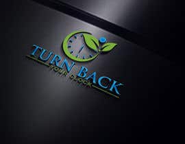
Putting this update on top so it doesn't get lost! Updated 6/12 at 9:07 am EST> I am open to looking at different ideas... but I've attached a free hand drawing of what I'm trying to describe... using the man and woman silhouette, and the color I'm looking for for the TBYC letters on both the written name, and on the clock face are the cobalt blue shown in the clock pic attachment. I'd also like the outline of the clock and the minute and hour hands that color as well. What I drew is pretty much what i'm looking for.. but as i said, if someone takes that idea and improves on it, I'd consider it. That said, I'd really like to see a professionally done version of what I've drawn and described :) Thanks!


My name is James, I'm launching a new brand focused on health, wellness, and anti-aging products, services and info for every of us that is 1) getting older and 2) not happy about it! The brand is called Turn Back Your Clock (with James Kuhn) or TBYC. We distribute two products currently, one for ketogenic dieting, and one that is the only FDA registered, homeopathic HGH gel applied transdermally.... and it is going viral. I need a sleek and clever logo for TBYC.

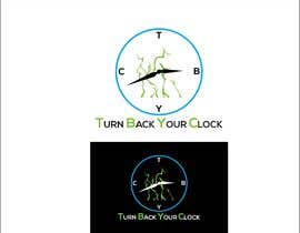
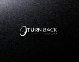
I have an idea or two... involving a clock face, perhaps with TBYC as the 12-3-6-9 points on the dial... I had an idea of a minimalist male and female form, just an outline that conveys both gender and physical fitness... each holding one hand of the clock, pushing or pulling back against it, almost like working out. For instance, having the clock hands reading 11:55, and having the woman pulling on the minute hand on one side, and the male pushing against the hour hand on the other. I don't know if I'm adequately painting my mental picture! My other idea is a little more cartoon-ish and probably more of an image I'll put on a shirt than the look I want... like the clock actually marching forward and a healthy man and woman standing defiantly against it as if actually 'turning it back' in battle. The only thing I've used so far, in the absence of a logo... is a clock face with the numbers reversed (file uploaded)... which was better than nothing... but far from what I envision going forward. THESE ARE JUST IDEAS... NOT DIRECTIONS... looking forward to being inspired by actual artists with talent... not just my own thoughts! :)

I added some images... one is a cool outline of a man and a woman... I would do something like this, split, one on each side of the clock. I included the cobalt blue clock to show the color and metallic look I like...

Habilidades recomendadas

Principales propuestas de este concurso

Ver más participaciones

Tablero de aclaración pública

  • joynul1234
    joynul1234
    • 4 años atrás

    Sir, I Have a problem, I upload a high-resolution file on the chat-box, then it makes my browser very slow and it reloads again and again, That's why I can not upload any file or message to your chat-box.

    • 4 años atrás
  • joynul1234
    joynul1234
    • 4 años atrás

    Sir, I Have a problem, I upload a high-resolution file on the chat-box, then it makes my browser very slow and it reloads again and again, That's why I can not upload any file or message to your chat-box.

    • 4 años atrás
  • rahatmahmud7396
    rahatmahmud7396
    • 4 años atrás

    #64 check it

    • 4 años atrás
  • Insane99
    Insane99
    • 4 años atrás

    #63 , #62

    • 4 años atrás
  • joynul1234
    joynul1234
    • 4 años atrás

    Sir please Check my entry & good feedback me #47 ,,,, thank you..........

    • 4 años atrás
  • joynul1234
    joynul1234
    • 4 años atrás

    sir, please Check #41 , #42 , thanks....

    • 4 años atrás
  • joynul1234
    joynul1234
    • 4 años atrás

    sir, Please Check #40

    • 4 años atrás
  • ivnesuvon5
    ivnesuvon5
    • 4 años atrás

    #26

    • 4 años atrás
  • Bidnismayn
    Organizador del concurso
    • 4 años atrás

    Quick clarification... i see a lot of logos with TRUN... it should be TURN...

    • 4 años atrás
  • joynul1234
    joynul1234
    • 4 años atrás

    Sir, Please Check my Entry . #19 ,

    • 4 años atrás
  • ivnesuvon5
    ivnesuvon5
    • 4 años atrás

    Please check #10

    • 4 años atrás
    1. Bidnismayn
      Organizador del concurso
      • 4 años atrás

      Its still to much of a crescent... please look at the new attachment(s) I provided, and the additional description i added at the very top of the posting, and you'll see a pretty good idea of what i'm after...

      • 4 años atrás
  • Bidnismayn
    Organizador del concurso
    • 4 años atrás

    A little while ago I had a thought about a simple clock face, a black ring, with each letter, T B Y C... making up the 12 3 6 and 9 spots. Then, have the hands appearing to move backwards by having a blur effect. The hands would be actual, metallic not drawn, in cobalt blue. Then a male and female outline standing next to it.. one on each side. I just pulled some silhouettes that could work well... attaching

    • 4 años atrás
  • ivnesuvon5
    ivnesuvon5
    • 4 años atrás

    please check #3

    • 4 años atrás
    1. Bidnismayn
      Organizador del concurso
      • 4 años atrás

      Clever, I like this one the best so far. That said, I am not a fan of a giant crescent. Interesting concept.

      • 4 años atrás

Mostrar más comentarios

Cómo comenzar con los concursos

  • Publica tu concurso

    Publica tu concurso Fácil y rápido

  • Recibe montones de propuestas

    Consigue toneladas de propuestas De todo el mundo

  • Elige la mejor propuesta

    Elige la mejor propuesta ¡Descarga fácilmente los archivos!

Publica un concurso ahora o únete a nosotros hoy