Graphic Design for Aslan Corporation
- Estado: Closed
- Premio: $100
- Propuestas recibidas: 29
- Ganador: proxlservice

Resumen del concurso
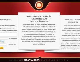
Polished beautiful design for our single-page web site.
Habilidades recomendadas
Comentarios del empleador
“Excellent designer. Was easy to work with and produced numerous versions until we had just the design I wanted. Highly recommended. ”
![]() subpariq, United States.
subpariq, United States.
Tablero de aclaración pública
-

Salbatyku
- 12 años atrás
Dear Ch, i have forgot to submit my entry, how can i give it to you ?
- 12 años atrás
-

JesseNgatai
- 12 años atrás
Please kindly check #36 ... I ran out of time But would of liked to place an asian pattern in the top red header part. it would be transparent and not very over bearing to keep in line with the designs simple and clean design.
- 12 años atrás
-
JesseNgatai
- 12 años atrás
not sure I'm allowed to do this.. but here is a version with a background on it. As i ran out of time just minutes after the closing. http://jessengatai.com/freelancer/concept4.jpg ... its the same but with an asian design in the background behind the logo.
- 12 años atrás
-

Five7FourGFX
- 12 años atrás
updated my post check #34
- 12 años atrás
-
Smartdotsteam
- 12 años atrás
#31 , have another background , Tnx
- 12 años atrás
-
Smartdotsteam
- 12 años atrás
Check #30 , Thanks
- 12 años atrás
-
JesseNgatai
- 12 años atrás
Hi, please see design #24 ... Let me know if you would like to see some revisions or if this is on the right track. Hope you like it :)
- 12 años atrás
-
JesseNgatai
- 12 años atrás
ps. I just noticed I left out the security number. If you do like this design I'll reupload with number included. Also as you are a programming software company I kept it very nice and clean to give it that corporate edge.
- 12 años atrás
-

success2gether
- 12 años atrás
Hi subpariq
Please rate my entries on #19 and #20. By the way, awesome logo you've got there :D
Thx
success2gether- 12 años atrás
-
success2gether
- 12 años atrás
Any feedback are really useful for both of us.
- 12 años atrás
-

Organizador del concurso - 12 años atrás
Thanks for your submissions. We're looking for a style that is a little less busy and doesn't overuse the logo. thanks for the complement on the logo.
- 12 años atrás
-

premvishrant
- 12 años atrás
Hi!
checkout the polished one #22 ...- 12 años atrás
-

badhon86
- 12 años atrás
Hello subpariq, Please take a look at my design #18 , I have made the design neat & clean. Hope you like. Thanks
- 12 años atrás
-
badhon86
- 12 años atrás
Some texture are not visible in the preview but still there are some nice detail texture in the header, footer & main body section. May be the web site compressed the preview image.
- 12 años atrás
-
badhon86
- 12 años atrás
please go to this link for full preview to see the texture I have used https://i.minus.com/ibniPoxv8Lacjq.jpg
- 12 años atrás
-

anisun
- 12 años atrás
plz check #14 & 15 with color chenges
- 12 años atrás
-
anisun
- 12 años atrás
[lz check #13
- 12 años atrás
-
premvishrant
- 12 años atrás
Please review #9
Really Plosihed design with pixel perfect layout and used the Furious color theme.- 12 años atrás
-

jyambaya
- 12 años atrás
Good day sir! Let me know your feedback. Thanks!
- 12 años atrás
Ver 2 mensajes más
-
Organizador del concurso - 12 años atrás
I understand your reasoning. I wonder if maybe you could have two columns inside that one inset section, but made the entire width wider than it is.
- 12 años atrás
-
jyambaya
- 12 años atrás
well, thats just a sample sir. we can do it much better if you'll choose me. hoping to work with you soon. thanks!
- 12 años atrás
-

joka232
- 12 años atrás
feedback for #8 please
- 12 años atrás
-
Organizador del concurso - 12 años atrás
That's a pretty design. I'm concerned about how the last section, "Contact" is not centered and the various contact input elements aren't very well placed. Is that your intent?
- 12 años atrás
-
joka232
- 12 años atrás
hehe, well yes,it makes it a good size and its good room for the patterns and graphics..what would make it better?
- 12 años atrás
-
Organizador del concurso - 12 años atrás
Incidentally, please note that the company name is "Aslan Corporation", not "Asian Corporation."
- 12 años atrás
-

kaulg
- 12 años atrás
Hi. Have put this page together keeping in mind your company. Have tred to make it neat and professional, not too many frills which take away from the product. Let me know if this is in the general direction of what you have in mind. Incidentally, I am also a content writer, if you need anything to be wriiten for the site. Thanks!
- 12 años atrás
-
Organizador del concurso - 12 años atrás
Generally, I Like your designs. However, I do not wish to modify the logo if at all possible. Yes, after the site design is complete, we will need content for the three sections.
- 12 años atrás
-
kaulg
- 12 años atrás
Hi. Thanks for your feedback. Have uploaded another one. Can make fix the logo in the earlier designs too, if needed. If you need the content as well, let me know. Thanks.
- 12 años atrás
-
Organizador del concurso - 12 años atrás
MajorKrea, I find your design in #5 very interesting. In fact, I can imagine some interesting animation taking place as the sections might expand when a mouse is over them. However, things seem a little narrow in the center section with the two paragraphs.
- 12 años atrás
-

MajorKrea
- 12 años atrás
Hi Subpariq
i submit another one.- 12 años atrás
Cómo comenzar con los concursos
-

Publica tu concurso Fácil y rápido
-

Consigue toneladas de propuestas De todo el mundo
-

Elige la mejor propuesta ¡Descarga fácilmente los archivos!