Logo Design for Asynx Software Inc
- Estado: Closed
- Premio: $290
- Propuestas recibidas: 18
- Ganador: maidenbrands

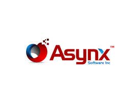
Resumen del concurso
Innovative software company
Habilidades recomendadas
Comentarios del empleador
“Maidenbrands is a true artist and perfect designer. When I saw the logo the first time, I immediatly knew that it will be it. Thank you !”
![]() asynx, United States.
asynx, United States.
Tablero de aclaración pública
-

vaanigraphic
- 12 años atrás
:) #154
- 12 años atrás
-
vaanigraphic
- 12 años atrás
- 12 años atrás
-
vaanigraphic
- 12 años atrás
#153 many more style change :) ck this
- 12 años atrás
-

Clarify
- 12 años atrás
congrats maiden well done
- 12 años atrás
-

maidenbrands
- 12 años atrás
thanks mate :)
- 12 años atrás
-

hungdesign
- 12 años atrás
Please check #152
- 12 años atrás
-

HAROON1111
- 12 años atrás
plz check
#151
thnx...- 12 años atrás
-

daisy786
- 12 años atrás
Please check # 150
- 12 años atrás
-
daisy786
- 12 años atrás
Please check # 149
- 12 años atrás
-
safi97
- 12 años atrás
Please check #132 and feedback me sir.
- 12 años atrás
-

lugas
- 12 años atrás
Hey, @patrickpamittan GOOD LUCK!
#49 http://www.freelancer.com/contest/Logo-Design-for-Anetech-6851-byentry-568844.html- 12 años atrás
Ver 4 mensajes más
-
lugas
- 12 años atrás
@patrickpamittan, Why didn't you explain that to Contest Holder of Asynx Software Logo Contest? You WERE on top entries! Better, get a letter "A" design collection and submit them in this contest :) And why jealousy? I respect ALL here... So, I suggest you to give respect in EVERY contest you participate!
Hope you will win all the contest :)
PEACE!- 12 años atrás
-

patrickpamittan
- 12 años atrás
THINK before you POST :)
- 12 años atrás
-

khurramjaved80
- 12 años atrás
Hi CH plz check PM
thanks- 12 años atrás
-
khurramjaved80
- 12 años atrás
http://www.google.com.pk/imgres?imgurl=http://www.themarketers.in/wp-content/uploads/2010/12/airtel-logo-1.jpg&imgrefurl=http://www.themarketers.in/airtel-rebranding-why-on-earth/&usg=__fzwUl-UEJgqlsqsmxlqqfnJsi5k=&h=269&w=251&sz=11&hl=en&start=7&zoom=1&tbnid=uAl7RNQqJtcwsM:&tbnh=113&tbnw=105&ei=GuutT9mdFdDIrQellN3mAw&prev=/search%3Fq%3Dairtel%2Blogo%26hl%3Den%26sa%3DX%26biw%3D1266%26bih%3D862%26tbm%3Disch%26prmd%3Dimvnsz&itbs=1
- 12 años atrás
-
patrickpamittan
- 12 años atrás
@lugas #49 http://www.freelancer.com/contest/Logo-Design-for-Anetech-6851-byentry-568844.html. The link you provided is my entry. I'ts alright to put the same entry on the same contest as long as it is not yet declared as winner So what's your point? I will withdraw it because of your jealousy. Good luck on your enties. Hope you will win all the contest :)
- 12 años atrás
-
patrickpamittan
- 12 años atrás
God Bless:)
- 12 años atrás
-

sjsrikanth
- 12 años atrás
Please check ..and suggest changes #125
- 12 años atrás
-
vaanigraphic
- 12 años atrás
#121 #122 plz feeback
- 12 años atrás
-
vaanigraphic
- 12 años atrás
#108 plz feedback
- 12 años atrás
-
Organizador del concurso - 12 años atrás
The blue ball could be smaller, keeping some white around it ? But I understand now that you are a true professional designer !
- 12 años atrás
-

AndrewVFX
- 12 años atrás
#115 #116 #117 ^_^
- 12 años atrás
-
AndrewVFX
- 12 años atrás
looking forward for your feedback, thanks ^_^
- 12 años atrás
-
AndrewVFX
- 12 años atrás
Very tough competition, Logos are nice here, Goodluck to all ^_^
- 12 años atrás
-
vaanigraphic
- 12 años atrás
plz feedbaack
- 12 años atrás
-
vaanigraphic
- 12 años atrás
#107 #104 #99 :)
- 12 años atrás
-
Organizador del concurso - 12 años atrás
Thas gonna be a very hard descission !
- 12 años atrás
-
Clarify
- 12 años atrás
#102 :)
- 12 años atrás
-
Organizador del concurso - 12 años atrás
Yeah, that look much more integratec and stylish !
- 12 años atrás
-
Clarify
- 12 años atrás
#97 thanks
- 12 años atrás
-
Organizador del concurso - 12 años atrás
NICE !
- 12 años atrás
-
Organizador del concurso - 12 años atrás
#95, maybe the red logo to the left of Asynx, I like the shape !
- 12 años atrás
-
hungdesign
- 12 años atrás
i want u check #85, thanks
- 12 años atrás
-
Organizador del concurso - 12 años atrás
Not bad, I like it.
- 12 años atrás
-
hungdesign
- 12 años atrás
thanks CH
- 12 años atrás
-
Clarify
- 12 años atrás
#82 and #81 thanks
- 12 años atrás
-
Organizador del concurso - 12 años atrás
I like #31 for its simplicety and futuristic design. The "x" at the end should just be the letter "x" and no box around it.
On #1, I like that the logo itself can also be used without the Text. #12 is also good because the style is constant.- 12 años atrás
-

evoss
- 12 años atrás
Hi! Thanks for your comment on my #31 . I ensure you it's really good without the box also! I will post again so you can see it.
- 12 años atrás
-
Organizador del concurso - 12 años atrás
Thank you, I like the new version. I knew it also looks good without.
- 12 años atrás
-
Organizador del concurso - 12 años atrás
#72 just blew me away, it is exactly the type of design I like. It conatains all elements I was looking for.
- 12 años atrás
-
Clarify
- 12 años atrás
@ajoodesigner don't copy AkashBro design with #64 you know what i mean
- 12 años atrás
-

ajoodesigner
- 12 años atrás
My dear I know this not you can see this not as you thinking e this @ but i know that is copy from all same i have seen at 99designs :)
- 12 años atrás
-
Organizador del concurso - 12 años atrás
It is not my favorite logo, I need something more compact and "quiet", this one is too "loud" for me.
- 12 años atrás
-
PlatinumStudios
- 12 años atrás
That is really sad. I dont know how many time I have seen this same A in many a contest, but it is getting old. And shame on you khurramjaved80 for submitting the same element in design #7 to another contest seen here:
http://www.freelancer.com/contest/Logo-Design-for-Allihub-6813-byentry-570147.html, http://www.freelancer.com/contest/Logo-Design-for-Allihub-6813-byentry-570151.html and http://www.freelancer.com/contest/Logo-Design-for-Allihub-6813-byentry-570155.html
It is lazy designers like this that make copyright lawyers rich.- 12 años atrás
-
Organizador del concurso - 12 años atrás
OK, Thanks
- 12 años atrás
-
ajoodesigner
- 12 años atrás
Please sir #64 feedback
- 12 años atrás
-

rehanismail
- 12 años atrás
feedback for my #62 & #67 of logos...
- 12 años atrás
-
Organizador del concurso - 12 años atrás
The @ is a great idea ! @synx #37. The logo is too "hard" and I dont like the font
- 12 años atrás
Cómo comenzar con los concursos
-

Publica tu concurso Fácil y rápido
-

Consigue toneladas de propuestas De todo el mundo
-

Elige la mejor propuesta ¡Descarga fácilmente los archivos!