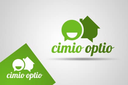
Logo Design for CIMIO / OPTIO Real Estate App
- Estado: Closed
- Premio: $290
- Propuestas recibidas: 3
- Ganador: pandojevito

Resumen del concurso
This is an application for web and mobile that helps real estate agents/brokers communicate with sellers/buyers, regarding properties for sale or required. The application is for North America. Our target market is stylish, modern, tech savvy.
Habilidades recomendadas
Comentarios del empleador
“Brilliant logo designer! Knows how to properly convert client requirements into perfect designs!”
![]() conversionlab, Canada.
conversionlab, Canada.
Tablero de aclaración pública
-

bestidea1
- 11 años atrás
#251 ?
- 11 años atrás
-

Organizador del concurso - 11 años atrás
Excellent submission, thank you. Unfortunately a little too late though. Thanks again!
- 11 años atrás
-
bestidea1
- 11 años atrás
your welcome .
- 11 años atrás
-

Frontiere
- 11 años atrás
Please CH , show some respect to designers and they hard work . First 4 star rating , then reject .
- 11 años atrás
Ver 1 mensaje mas
-
Organizador del concurso - 11 años atrás
********************** ATTENTION ************************
We believe that we'll be choosing #244, and asking the designer for final revisions for colour.
If you are still interested in submitting designs to this contest please be forewarned that your submission will be directly compared to #244, and immediately accepted or rejected on that basis.
We would like to thank all the designers who participated. We appreciate every entry that we received and the constant creativity was exciting. Please follow us on Freelancer, as we will be doing more of these contest for future projects.- 11 años atrás
-

guyone001
- 11 años atrás
hello contest holder.
In one of the points you have mentioned that you dont like sans fonts. But all your highest rated entries have sans fonts. Does that mean your terms are flexible?- 11 años atrás
-
Organizador del concurso - 11 años atrás
Our mistake, that should have said that we don't like "serif" fonts. We DO like "sans-serif". But regardless, of course we're flexible. Thanks for pointing out that error though. Show us it works and we'll buy it. All the highest rated are highly rated because of the following attributes:
1. They represent communication.
2. They incorporate a house.
3. They can be split well, using color or symmetry.
4. They do not use the "/".
5. They don't include redundant or useless elements, i.e. everything displayed has its purpose.
6. They're minimalistic.- 11 años atrás
-
Organizador del concurso - 11 años atrás
*** If we've reject your designs but you can still submit, it means we feel you have the skill and creativity to possibly supply us with the logo we're hoping for.
*** If you cannot submit anymore, it means we don't think it is likely that we'd choose any of your designs. Thank you for participating.- 11 años atrás
-
Organizador del concurso - 11 años atrás
Competitions starting to get fierce. Thanks for the hard work everyone. This one is going to be a hard decision.
- 11 años atrás
-
Organizador del concurso - 11 años atrás
Thanks for all your entries. Later today we will be going through an removing some of the designers who we believe will be unable to provide the type of logo we need. If you are one of the designers we remove, we'd like to take this time to thank you for your participation in this contest. The only reason you are being removed is to ensure you do not spend more of your time submitting to this contest, to continually receive lower ratings. We wish you the most success in your endeavours!
- 11 años atrás
-

awgie
- 11 años atrás
wow to #50
- 11 años atrás
-
Organizador del concurso - 11 años atrás
Please to not put the "/" between the words, as it will not be a part of our trademark.
- 11 años atrás
-
Organizador del concurso - 11 años atrás
Ratings:
1 star = the logo doesn't follow the brief.
2 stars = the logo followed the brief and has potential, but is too generic and does not stand out
3 stars = the logo could be a serious contender, but designer may need to revisit the brief and find ways to make it better
4 stars = the logo is excellent, completely follows the brief, but needs something to make it more appealing
5 stars = the logo is the type of logo we're looking for, but we're not completely sold on it yet. Other submissions will be compared to it.- 11 años atrás
-

pandojevito
- 11 años atrás
please check #8 thanks! :D
- 11 años atrás
-
Organizador del concurso - 11 años atrás
Brilliant. Excellent work. I'll be honest and say that I wouldn't like this font, but you've made it look excellent here! This is definitely a major contender!
- 11 años atrás
-

jummachangezi
- 11 años atrás
plz seal the contest for fair contest , thanks
- 11 años atrás
-
Organizador del concurso - 11 años atrás
Jumma, I won't seal it. However, I will pay attention and not award the project to blatant copying of designs. Please remember everyone needs sources of inspiration. Copying is not acceptable, but if one person's design triggers ideas within another designer, I believe that is to be expected. After all, it's 2013. What is truly original anymore?
- 11 años atrás
Cómo comenzar con los concursos
-

Publica tu concurso Fácil y rápido
-

Consigue toneladas de propuestas De todo el mundo
-

Elige la mejor propuesta ¡Descarga fácilmente los archivos!