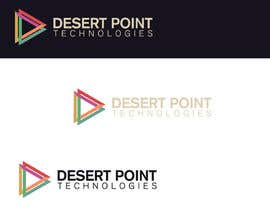
Logo Design for Technology company
- Estado: Closed
- Premio: $120
- Propuestas recibidas: 30
- Ganador: winarto2012

Resumen del concurso
We need a logo for our new company called "Desert Point Technologies"
We need a serious, simple but innovative design.
Our company brings TI solutions for industrial companies, mining, construction and logistic.
New Information:
Hi everybody. Thanks you very much for your proposals but for being honest, we dont like any of the design for the moment. I have select some design of logo, to give you some reference. They are attached to the brief.
Attached number 1 we like the colors of the logo and the tipography. Not the logo
Attached number 2: We like almost everything.
Attached number 9: We only like the logo not the typography.
Attached number 10: We like the tipography and the logo. We dont like the colors of the logo.
For the structure of the logo and tipography, we like "Desert Point" over "technologies" with the logo at the left, like proposal number 47 or 42.
Its not necessary to work with the dot or a line !!! Actually you can make something very similar (or equal) to referentials logos.
Please show logo over a white background.
We need the logo in AI and PNG
Thanks for your proposal !
Habilidades recomendadas
Tablero de aclaración pública
-

sourav221v
- 11 años atrás
Congratulations @winarto2012.
- 11 años atrás
-

winarto2012
- 11 años atrás
thanks saurav221v :)
- 11 años atrás
-

sqhrizvi110
- 11 años atrás
sharpminds40 your design #194 accidentally resemblance with Balkanpack
http://www.logoarena.com/logo-contests/balkanpack-n400-d226- 11 años atrás
-
DigiMonkey
- 11 años atrás
It happens... but still not the same logo.
- 11 años atrás
-

sharpminds40
- 11 años atrás
:) there are thousands of designs based on basic shapes like circle, triangle and square. At times, accidental resemblance is but natural.
@DigiMonkey you are right
thanks mates- 11 años atrás
-
guyone001
- 11 años atrás
u said u need to see the logo on a white background. 9 of the 10 highest rated entries just did the opposite.
- 11 años atrás
-
zilonard
- 11 años atrás
check this #239 i wish u like it
- 11 años atrás
-

rashedhannan
- 11 años atrás
check my designs.....hope these will run for the Desert Point technology.
- 11 años atrás
Ver 3 mensajes más
-
rashedhannan
- 11 años atrás
#150
- 11 años atrás
-
rashedhannan
- 11 años atrás
#219 , #221 , #226, #229 , #232
- 11 años atrás
-

softechnos5
- 11 años atrás
#66 is copied from - http://us.fotolia.com/id/43487597
- 11 años atrás
-
softechnos5
- 11 años atrás
Dear Sir, Please see my entry #207 and see PMB.
- 11 años atrás
-

Rajmonty
- 11 años atrás
Hi sir,please check #199 #200 Thanks :)
- 11 años atrás
-
softechnos5
- 11 años atrás
Hi Sir, I hope you are doing well. Please wait for my entry. Thanks!
- 11 años atrás
-

RoxanaFR
- 11 años atrás
hello! Please check #173, #176
- 11 años atrás
-
RoxanaFR
- 11 años atrás
Also #178, #179, #180, #182, #183, #184, #185. Thank you! Best regards. Don't hesitate to request for other changes.
- 11 años atrás
-
angelmansi
- 11 años atrás
Please check #158 #159 #160 #161 #162 #163 #164
- 11 años atrás
-

Organizador del concurso - 11 años atrás
Remember that you can use the same logos of the files attached. For the colors use the ones of file attached nº1
- 11 años atrás
-
Organizador del concurso - 11 años atrás
Attached number 1 we like the colors of the logo and the tipography. Not the logo
Attached number 2: We like almost everything.
Attached number 9: We only like the logo not the typography.
Attached number 10: We like the tipography and the logo. We dont like the colors of the logo.- 11 años atrás
-

sultandesign
- 11 años atrás
please check my new design
- 11 años atrás
-
Organizador del concurso - 11 años atrás
Hi everybody. Thanks you very much for your proposals but for being honest, we dont like any of the design for the moment. I have select some design of logo, to give you some reference. They are attached to the brief.
For the structure of the logo and tipography, we like "Desert Point" over "technologies" with the logo at the left, like proposal number 47 or 42.
Its not necessary to work with the dot or a line !!! Actually you can make something very similar to referentials logos attached to the work and we are going to be glad.- 11 años atrás
-

anagabrielare
- 11 años atrás
please check #99 y #100
cheers- 11 años atrás
-
anagabrielare
- 11 años atrás
#101 y #102, I upload them again because I misspelled it :) cheers
- 11 años atrás
-
Suckre
- 11 años atrás
hi
- 11 años atrás
-
softechnos5
- 11 años atrás
Hi CH, I am interested in your contest would you tell me about your business that it is related to which kind of technology?
Thanks!
Mana- 11 años atrás
-

sushil69
- 11 años atrás
Pl check #79 and #80 thanks.
- 11 años atrás
-

Don67
- 11 años atrás
please check and feedback thanks
- 11 años atrás
-

rsc17smart
- 11 años atrás
Check #57 and #58 please and feedback. Thanks!
- 11 años atrás
-

ivegotlost
- 11 años atrás
Hi CH, kindly check and rate #48, thanks!
- 11 años atrás
-

bogdanrata
- 11 años atrás
feedback and ratings would help us
- 11 años atrás
-

ndofar
- 11 años atrás
Please check #24 (a revised version from previously #19 , with Technologies text), maybe you interested.
- 11 años atrás
-
bogdanrata
- 11 años atrás
Please have a look at #17 and #20. Let me know what you think about them. Thank you !
- 11 años atrás
-
ashraf09
- 11 años atrás
Hello!
Contest holder,I submitted a logo design for your company and hope your feedback.Thanks! ashraf09- 11 años atrás
-
ironizor
- 11 años atrás
i would like to get a feedback , thank you
- 11 años atrás
Cómo comenzar con los concursos
-

Publica tu concurso Fácil y rápido
-

Consigue toneladas de propuestas De todo el mundo
-

Elige la mejor propuesta ¡Descarga fácilmente los archivos!