mqu5a34eebe35ad2
Pakistan

To create a signature/logo for my pen name to be used on a website, business card, book and a large poster stand 600cm x 1000cm
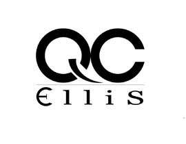
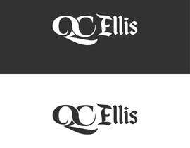
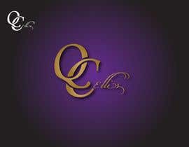
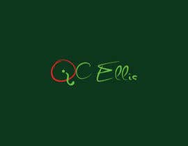
The signature is for the words “QC Ellis”. Vector graphic – for resizing – preferred.
A photoshop image (or other bitmap software) is acceptable as long as there is an image large enough for the banner (at 300dpi minimum) as well as a smaller version for the book and business card (300dpi) and it can convert to 70dpi for the website.
The image needs to be in .png with transparent background plus the source file (I prefer .svg but can be negotiated).
Colours:
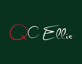
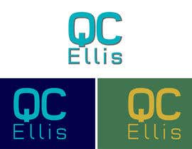
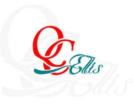
I’ve attached an image with my attempt. As you can see, I like turquoise, greens and blues. The image may be placed on a dark blue background but also needs to be able to stand on a white background (maybe with a shadow added). I also like gold (especially on a dark-green background).
I’d like the Q to be a different (highlighted) colour from the rest of the name.
These are the colours I use presently:
#00ff00 - All One Planet logo
#000080 - Background
Colour combinations are open to negotiation.
Design:
In my attempt, I have gone for rather plain fonts so as to be easily readable, however, it lacks flare.
I’d prefer a landscape shape design (horizontal – due to the space most website templates give for the logo) but am open to a portrait (vertical/diagonal) design if it’s amazing.
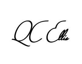
As you can see on my image, I like the idea of the Q integrating a question mark. You are welcome to take this idea and expand/enhance it (this is my preference).
Who/what this represents:
I'm a coach and teacher of meditation, mindfulness and personal/spiritual growth. I'm professional, with many qualifications and am presently writing a book to help people with anxiety to use mindfulness; plus a little one on connecting with one's true nature (underneath all the crap haha).
########
POINTS OF CLARITY (I mentioned in the comments):
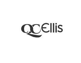
* All entries with "Qc Ellis" or "QC ellis" are being rejected. I'm not a fan of "qc ellis" either.
* I am looking for a unique design, not just the best pick of a Google Font - I could have done that. It is OK to use a great font as the basis but there needs to be something unique.
* The image (attached) helps clarify a couple of points I made above - eg: the Q looks a bit like a question mark. You will also see I like the idea of the E being round, reflecting the curvature of the C. Having said that, I am also open to being blown away by something extra special.
* I'm not into big flourishes around the capital letters, therefore each letter in the word needs to be legible - preferably when small as well as large. The leg of the Q - flowing underneath the rest of the words could be OK.
:-)


Publica tu concurso Fácil y rápido

Consigue toneladas de propuestas De todo el mundo

Elige la mejor propuesta ¡Descarga fácilmente los archivos!