oussamamhadhbi25
Tunisia

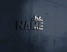
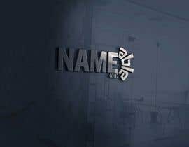
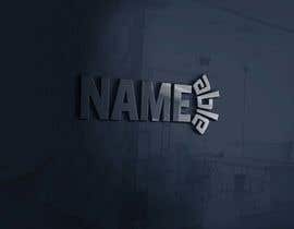
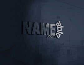
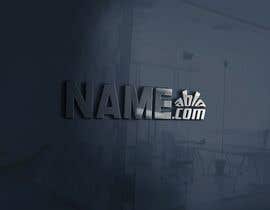
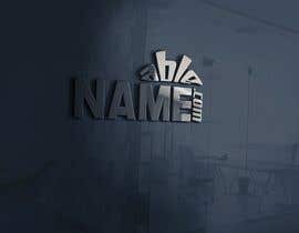
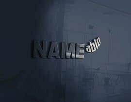
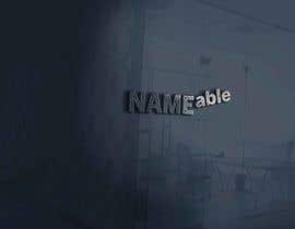
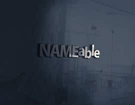
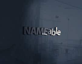
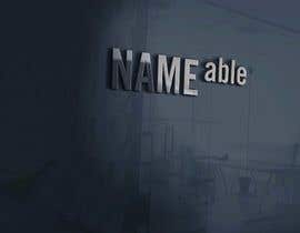
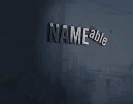
Logo is for the following brand name: "Nameable"
There should be no extraneous graphics at all. Only text.
Color can be all black. Or it could be 2 different colors. Ideally I don't want to commit to any particular color yet. It would be nice to see a version of the logo with 2 different colors, but I'd want the ability to change what those colors ARE.
Actually, if you want to try some kind of color gradient or shadow to create a cool effect, I'm open to that. Or it can just be black text. One of the font variants I found was called "rust", and I liked the effect. (See attachment.) By saying that, I don't mean that you need to use THAT effect – or any effect at all. But I'm open to ideas to make the logo stand out from other text on the web page or in printed materials – i.e. to look more like a logo. But primarily I care about the font itself and the spacing between letters.
Fonts must be sans serif.
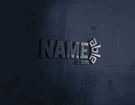
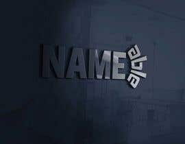
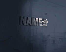
Specifically, it should be written as "NAME" + "able" or else as "NAME" + "ABLE". The first 4 letters must be upper case. The last 4 letters can be lower case or upper case, depending on the font used. I'm looking for a way to differentiate the first 4 letters from the last 4 letters based on font.
The first 4 letters should ideally be in the following font:
"Trade Gothic® Next Condensed Heavy"
https://www.fonts.com/font/linotype/trade-gothic-next
If you don't have access to that specific font, then something very similar should be used.
One option I like for the last 4 letters is lowercase in this font:
"Trade Gothic® Next Condensed Bold"
https://www.fonts.com/font/linotype/trade-gothic-next
It's slightly different – less weighty. But it's still related to the font in the first 4 letters. I don't want anything distractingly different. The 2 fonts CAN be different. But I definitely don't want squiggly cursive or whacky zany fonts for the last 4 letters. The logo needs to be legible, clear, solid, professional.
Right now what I'm thinking would work is the following:
1. For the lower case "able", shrink the font so that the vertical height of the "a" is equal to the vertical height of 2 prongs of the uppercase "E" – which is the 4th letter – as measured from the very top of the top prong to the bottom of the middle prong.
2. Once the "able" is shrunk to match the spread of 2 prongs of the "E", then raise the "able" so that the top of the "b" reaches the top of the "NAME" and extends down to the bottom of the middle prong of the "E". This will leave some space underneath the "able".
3. This is meant to show the "able" as a kind of exponent – as in mathematics, squaring or cubing or raising to the power of N. The text isn't shrunk very small, but it is lifted up a bit.
4. In the gap underneath the "able", I'd like to try more than 1 thing. It might just be empty space. Or it could be a horizontal line that extends the width of the "able" and which has the vertical width equal to the lower prong of the uppercase "E" in "NAME". Or instead of a solid line it could be a dotted line. Or it could be the suffix ".com" in lowercase, spread out to fall evenly under the 4 letters of "able".
You can be a little bit creative with the "able". I'm open to ideas to some extent. But I've tried to give a clear description of 1 approach that I think WOULD satisfy the objectives.
Alternatively, you could do the following:
1. Shrink the "able" so that the vertical height of the lowercase "a" is equal to the outside width of 2 prongs of the capital "E" (as described above).
2. Keep the "able" aligned to the bottom of the "NAME".
3. As a result of shrinking, the "b" and "l" no longer reach the top of the "NAME". Those 2 letters can have their stems lengthened vertically to reach the top.
See the attached files for a rough sense of what this might look like.
Logo files should allow us (or a future graphic designer) to edit the color through an application such as Adobe Illustrator.
“Md. Al-Amin provided an impressive variety of logo designs. In addition to the diversity of his own ideas, he listened carefully to my suggestions for modifying them. All of the changes that I requested – big and small – he executed perfectly.”
![]() ImageAuthors, United States.
ImageAuthors, United States.


Publica tu concurso Fácil y rápido

Consigue toneladas de propuestas De todo el mundo

Elige la mejor propuesta ¡Descarga fácilmente los archivos!
