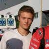
Photoshop Background for Band Publicity Photo
- Estado: Closed
- Premio: $40
- Propuestas recibidas: 60
- Ganador: elnestbantolo


Resumen del concurso
Hi folks. I would like the attached picture (ThunderPuppies_145) to be Photoshopped with a new background. See the other file attached (ONE.jpg) for an idea of what I'm looking for. A cool background that's fun and describes our band well as a high-energy comedic rock band for kids and families. Something very similar to the example, with colorful graffiti, would be great, but I'm open to whatever else you might show me.
I would also like the photo improved as far as the color, lighting/contrast, etc. (Again, use the ONE.jpg as an example of the vibrant colors of our shirts, etc.), and there is a slight slant to the shot, so if you can please correct that, I'd appreciate it. And if you can also black out the head of the drum and then put the "Thunder Puppies" full logo back onto it (shrink it a little as needed) from the other file (ThunderPuppies_145a.jpg), that would be great.
IMPORTANT: For whatever you add as the background, DO NOT ADD LICENSED MATERIAL OF ANY KIND. If you use imagery from Disney or Pixar or Star Wars or anything like that, then I CAN'T USE IT. I need to emphasize that because I hate to see your time and effort wasted. Also, I'm not a fan of musical notes and certain other graphical things like that... but especially musical notes. We're a band, we've got instruments... music is implied already.
You may need to consider copying a slice of the wall on the left side of the picture to insert on the right side... I'm not sure if the split between the two different walls will look good. Or, of course, you can remove the background entirely and just create something else there, but I do kind of like the look of the altered walls, like on the ONE.jpg example. I will be cropping the photo later, so I wouldn't put too much detail off to the right or to the top.
Any questions, please let me know. I will try to give feedback as best I can. And though there will only be one winner, there is a chance that I will want to offer something as a "runner-up" prize to be able to use other entries that were also great. That's what I did on a previous contest, and the attached image of ONE.jpg by "reblien" is an example of that.
Be creative and have fun!
Habilidades recomendadas
Comentarios del empleador
“Outstanding work. Very creative and adaptable. Great communication. Will definitely look to hire again.”
![]() EricHermanMusic, United States.
EricHermanMusic, United States.
Tablero de aclaración pública
-

Organizador del concurso - 10 años atrás
Thanks so much for the entries, everyone! I'm going to discuss things with the band and pick a winner, and possibly a runner-up winner or two, within the next few days.
- 10 años atrás
-
Organizador del concurso - 10 años atrás
#61 is better than #60 because the word "Stop" is obscured in #61 . Still needs better floor connection, though.
- 10 años atrás
-
Organizador del concurso - 10 años atrás
#62 : Very nice!
- 10 años atrás
-
Organizador del concurso - 10 años atrás
#59 : The color is still not quite right. Do an A-B with that against #8 or #32 and you should see the difference.
- 10 años atrás
-
Organizador del concurso - 10 años atrás
I definitely like #56 better than #57 . I would move "and the" over to the left and up a bit. Otherwise, it's great, though there's also something odd about seeing our reflections in what looks to be a wooden floor.
- 10 años atrás
-
Organizador del concurso - 10 años atrás
#53 : I really like the feel of the background now, but the color tone of the band isn't quite right.
- 10 años atrás
Ver 2 mensajes más
-
Organizador del concurso - 10 años atrás
Well, or less. I'm not exactly sure how to accomplish the right color tone. But if it ends up looking like #8 (and others like it), then that's what I would like.
- 10 años atrás
-
Organizador del concurso - 10 años atrás
Okay, I guess the kids are smiling, but because their eyes are closed, it looks like more of a sleeping thing. So that's maybe I mean by that. They look disengaged, somehow.
- 10 años atrás
-
Organizador del concurso - 10 años atrás
#55 : It needs to be "and the," and I would make it a little smaller and maybe in black. Also, please remove the cartoon of me.
- 10 años atrás
-
Organizador del concurso - 10 años atrás
#52 I don't really care for, but #51 is really good. The connection to the floor is much better, though still not entirely solid. The font is great now, but I think it does need the "and the" very small between "Eric Herman" and "Thunder Puppies."
- 10 años atrás
-
Organizador del concurso - 10 años atrás
And it looks like you're using a watermarked picture for the background. Unless you will purchase that to use, or create something yourself, then I can't use it.
- 10 años atrás
-
NicolasFragnito
- 10 años atrás
thanks for refund, I hope you like it
- 10 años atrás
-
Organizador del concurso - 10 años atrás
You are all really amazing, by the way. I love seeing what you come up with. Incredible work!
- 10 años atrás
-

ralucaioana78
- 10 años atrás
Well, truth is this is a fun project to work on! :) Thanks for all the detailed and considerate feedback to everyone, this is really something rarely seen.
- 10 años atrás
-
Organizador del concurso - 10 años atrás
I know there's some measure of a difficult connection between languages, not to mention that it's tricky enough as it is to communicate artistic qualities. It's hard for me to say exactly what I want, when I don't necessarily know what I want until I see it. You know what I mean? I don't like to be critical, but sometimes it's easier to describe what doesn't work. So if you are willing to take the time and effort to rework things, I'm happy to try to guide you in a direction closer to something that I could consider using.
- 10 años atrás
-
Organizador del concurso - 10 años atrás
#49 : Great.
- 10 años atrás
-
Organizador del concurso - 10 años atrás
#50 : I really like the background, but the band image looks too intense, in terms of the color.
- 10 años atrás
-
Organizador del concurso - 10 años atrás
#31 : The ground looks great, but there's still something way off about the color tone, compared to #8 as an example. I think you're going too far on saturation or color balance or something. Anyway, everything's terrific except for that, so if you can figure it out, that would be great.
- 10 años atrás
-

elnestbantolo
- 10 años atrás
Oh I'm sorry. I was thinking its the background tone. Are you referring to the band?
- 10 años atrás
-
Organizador del concurso - 10 años atrás
Right. I'm sorry I should have been more clear that I meant the band. You got it, though, for #32 .
- 10 años atrás
-
Organizador del concurso - 10 años atrás
#40 : The ground is much better, but it looks like the band could be a little darker in tone. See #8 or #38 for examples of how I want the band color tone to be.
- 10 años atrás
-
Organizador del concurso - 10 años atrás
By the way, I don't really care for the second picture with the effect filter on it.
- 10 años atrás
-
Organizador del concurso - 10 años atrás
#47 : There's something about the color combination you're using on the wall that doesn't quite work. #48 is better, but again, I don't like the color choice on the wall.
If using the band name, it should be "and the" in the middle and not "The Thunder Puppies."
Also, see my previous note to someone else about how I didn't like the cartoon of me being in there when I'm already in the shot, especially flipped backward so I'm playing the guitar left-handed.- 10 años atrás
-
Organizador del concurso - 10 años atrás
#45 and #46 : I really like the way you depicted the band name in #46 . That's fun, although the lettering is too hard to read. #46 is much more interesting and fun than #45 . In both pictures, though, the connection of the band to the ground is not strong enough.
- 10 años atrás
-
Organizador del concurso - 10 años atrás
#43 and #44 : "Thunder Puppies" should not be on the wall, without the full act name (see my previous messages). The "D" in "Thunder" is partially missing. The wall is too close to us. The color tone of the band looks close to what I want in #43 but not #44 . I do love the fog in #44 , though. That's really cool.
- 10 años atrás
-
Organizador del concurso - 10 años atrás
#42 : Cool, but I'm not sure it's interesting or unique enough to be considered.
- 10 años atrás
-
Organizador del concurso - 10 años atrás
#41 : The background is better, though the sharp pink is also a little much on the eyes. The band color tone could be better (see #8 ), and though I do like the new imagery, that blob of color above my shoulder on the left is kind of weird and distracting.
- 10 años atrás
-
Organizador del concurso - 10 años atrás
#39 : A couple of red flags on this one; the connection of the band to the ground doesn't look smooth, there are musical notes, and "Thunder Puppies" should not be in there on its own. Please read my previous messages about that (and about the musical notes thing).
- 10 años atrás
-
Organizador del concurso - 10 años atrás
#38 is great, but there's one little tiny thing where the green line from the backwards "R" is coming out onto the ground, and that looks a little weird.
- 10 años atrás
-
Organizador del concurso - 10 años atrás
#37 : It's really nice, but the background seems a little unfocused and uneven, as far as where things are and what they are.
- 10 años atrás
-

reblien
- 10 años atrás
#38 plz rate
- 10 años atrás
-
Organizador del concurso - 10 años atrás
#36 : The imagery is pretty good, but the background is very dark.
- 10 años atrás
-
Organizador del concurso - 10 años atrás
#35 : I like it a lot, but don't think the Eric Herman Rocks image will work in there.
- 10 años atrás
-
Organizador del concurso - 10 años atrás
#34 : Really nice.
- 10 años atrás
-
Organizador del concurso - 10 años atrás
#33 : Just flipping it backwards doesn't really fix that.
- 10 años atrás
-
Organizador del concurso - 10 años atrás
#32 : Yeah, that's it! I'm still not sure about the cartoon of me being in there, especially flipped as it is. But you can always pull that out later. This is the one to beat, no doubt. Great job.
- 10 años atrás
-
Organizador del concurso - 10 años atrás
#30 : I like the color on the wall better, but I really don't like the look or colors of the puzzle board floor.
- 10 años atrás
-
Organizador del concurso - 10 años atrás
#29 : I recognize that elephant! :o) Very good, though feels a little too bright/white. Can you experiment a little with the colors?
- 10 años atrás
-
Organizador del concurso - 10 años atrás
#25 : Really great. I LOVE the band logo the way you did it. And I also like the picture without the band logo. The only two things I'm not crazy about are the look of the band... too bright. See #8 for a great example of the tone I'm looking for. Also, the floor is kind of ugly or clashes with everything else. I'd like to see a couple of different things for the floor. But otherwise, this is terrific.
- 10 años atrás
-
Organizador del concurso - 10 años atrás
I think the thing about the floor is that, being as busy and colorful as it is, it's yet another thing for your eyes to take in from the picture. And the picture is already colorful and cool in several ways. But there's a saying that "when you feature everything, you feature nothing." You know what I mean? So I would try a pretty simple looking floor/ground. I really like the reflection kind of look of #14 , though I'm not sure if that would work as well for this design. And the color toning of the band really needs to be closer to #8 . But if you can do that, you would definitely be the leading contender at this point.
- 10 años atrás
-
Organizador del concurso - 10 años atrás
Good job, btw, on the drum head.
- 10 años atrás
-
Organizador del concurso - 10 años atrás
#24 , #26 , #27 : Good job on the band cutout and the floor integration, but they're all a bit odd as far as the color choices. #27 is probably the best, though that's still a little odd. Maybe it's the light blue that you seem to feature a lot, but something is clashing on these. Also, I do not want "Thunder Puppies" featured on these, unless you are going to include the full act name "Eric Herman and the Thunder Puppies." (See my previous comments about this.)
- 10 años atrás
-
Organizador del concurso - 10 años atrás
Note that your #14 was much closer to what I want. Did you see the note I sent you privately? There's a link to a mockup I made for how #14 might work better with the full name in there (Eric Herman and the Thunder Puppies). But I'd also like to see #14 without the big act name. I think it might work pretty well that way.
- 10 años atrás
-
Organizador del concurso - 10 años atrás
#23 : I'm sorry, but that's not working at all for me, with the flowers and the outlines. Thanks for the entries, though.
- 10 años atrás
-
Organizador del concurso - 10 años atrás
#28 is very nice. I would suggest not using blue for the wall, though. Better to contrast the background against what we're wearing. Also, though I like the imagery style a lot, it skews just a bit too "girly," especially on the left side. The dog in the clouds is great, but I would suggest moving that, and the sun and the birdcage down a bit, so the picture can be cropped closer to the band. Good job, though, in general.
- 10 años atrás
-
Organizador del concurso - 10 años atrás
#19 : The coloring isn't great on this one, and the name of the band takes up way too much space. The band itself should be featured a lot more.
- 10 años atrás
-
Organizador del concurso - 10 años atrás
Also, see the note in the brief about using musical notes... I would almost be okay with it in this entry because they're pretty well obscured and blend into everything reasonably well. Still, I'm not crazy about musical notes as a motif.
- 10 años atrás
-
cvetkovicnikola
- 10 años atrás
Thanks for opinion. I will continue to work on this project, and I hope that will look much better. Again thanks for cooperation!
- 10 años atrás
-
Organizador del concurso - 10 años atrás
#21 : Very good, but if the name of the band is going to be included (it was supposed to only be on the drum head), then please include the full name (Eric Herman and the Thunder Puppies, with more of an emphasis on "ERIC HERMAN"). Also, the "Thunder" is not very readable. I really like the writing style for "Puppies," though, and the dog/lightning bolt image is cool. I'd like to see this revised somewhat... would definitely be a contender.
- 10 años atrás
-
elnestbantolo
- 10 años atrás
Thank you very much for the critics. I will be sending you the revision soon. And because this is my first output in Freelancer it looks like I'm more excited and nervous on the output than the group.
- 10 años atrás
Cómo comenzar con los concursos
-

Publica tu concurso Fácil y rápido
-

Consigue toneladas de propuestas De todo el mundo
-

Elige la mejor propuesta ¡Descarga fácilmente los archivos!